Friday 26 April 2013
Task 4 and 5
4) Who is the main target audience for your product?
Our Main Target Audience: 16-29 Male
Ideal Target Audience Profile:
Name: Josh Hunt
Age: 18
Gender: Male
Lives: Pettswood, Greater London
Class: Working / Middle Class
Interests: Music, Sport, Modern Cinema
Favourite Films: Harry Brown, London Boulevard, Kidulthood, The Shawshank Redemption
Favourite Genre of Film: Drama or Social Realism
Favourite Television Programmes: Breaking Bad, Hustle, Sherlock, The Inbewteeners
Favourite TV Channel: Channel 4 or BBC 3
This profile is a perfect example of our target audience. He is interested in Modern cinema and his favourite genre of cinema is Drama or Social realism. Furthermore, he lives in London. therefore he will understand the culture that our film provides. The films and shows he enjoys are also similar products to ours. for example: London Boulevard and Hustle. His preference of channel is also relevant. Our film could be distributed by Channel 4, as it fits all of the conventions: Independent, low budget, British Film and set in the capital.
5) How did you attract/ address your target audience?
I took into consideration our target audience, and interviewed people that fit into our target audience and recorded there response to our film. Charlie, the films producer, asks questions such as: 'What did you think of the film?' and 'What target audience do you believe the film is?'
Interview #1
Interview #2
Interview #3
Interview #4
Our Main Target Audience: 16-29 Male
Ideal Target Audience Profile:
Name: Josh Hunt
Age: 18
Gender: Male
Lives: Pettswood, Greater London
Class: Working / Middle Class
Interests: Music, Sport, Modern Cinema
Favourite Films: Harry Brown, London Boulevard, Kidulthood, The Shawshank Redemption
Favourite Genre of Film: Drama or Social Realism
Favourite Television Programmes: Breaking Bad, Hustle, Sherlock, The Inbewteeners
Favourite TV Channel: Channel 4 or BBC 3
This profile is a perfect example of our target audience. He is interested in Modern cinema and his favourite genre of cinema is Drama or Social realism. Furthermore, he lives in London. therefore he will understand the culture that our film provides. The films and shows he enjoys are also similar products to ours. for example: London Boulevard and Hustle. His preference of channel is also relevant. Our film could be distributed by Channel 4, as it fits all of the conventions: Independent, low budget, British Film and set in the capital.
5) How did you attract/ address your target audience?
I took into consideration our target audience, and interviewed people that fit into our target audience and recorded there response to our film. Charlie, the films producer, asks questions such as: 'What did you think of the film?' and 'What target audience do you believe the film is?'
Interview #1
Name: Alex Rosling
Gender: Male
Age: 17
Lives: Bromley, Greater London
Class: Middle Class
Notes:
Alex liked the films edit and his favourite shot
was the London Eye time-lapse. Alex also compared the film to The Firm. We took this as a compliment, as the film saw relative critic success, as well as the film being in London, we saw the comparison to be acceptable
Interview #2
Name: Nick Hughes
Gender: Male
Age: 19
Lives: Keston Park, Greater London
Class: Working / Middle Class
Notes:
Nick enjoyed the film and his favourite shot was the match-on-action shot on westminster bridge
Interview #3
Name: Charlie Walters
Gender: Male
Age: 16
Lives: Orpington, Greater London
Class: Working Class
Notes:
Interview #4
Name: Ryan Claridge-Patient
Gender: Male
Age: 20
Lives: Hayes, Greater London
Class: Middle / Working Class
Notes:
Film Logo Ideas #2: London

Our film is set in the capital, and in the very heart of London, therefore it is fitting that the films logo is symbolic of its location. I also took inspiration from the film 'Train Spotting' (see right). I used the same font and took the same simplistic, yet effective approach.

I Developed this logo further and created a more complex design. To do this, i used Adobe Illustrator CS5.1. The software allowed me to manipulate the text into a more, free range.

I then used a neon edge glow effect on the silhouette of the London skyline. This gave the design a more urban and dusk like look.

What have you learnt about technologies from the process of constructing this product?
What have you learnt about technologies from the
process of constructing this product?
We then started to integrate pictures and videos into our blogs to help us get points across and also made our blogs more interesting. (EXAMPLE: opening sequences analysis).
Using programs such as as Prezzi and Go!Animate also made our blogs idea more interesting, and allowed us to break what would be big chunks of monotonous text into easily digestible chunks. (EXAMPLE: pitch to investors).
When it came to making our preliminary we had our first experience of the filming equipment; Sony HD DVC cameras and tripods. (EXAMPLE: Flikr pictures on Sam Richards AS Media Blog).
When editing our preliminary we had to learn to use Final Cut Express for Mac. We also learnt how to add sound into the background of our clips and manipulate them using effects. (EXAMPLE: Final Piece 'Downfall').
To do our directors commentary we also used a microphone and garage band to record and smoothen our voices. (EXAMPLE: Directors Commentary).
We also used Adobe Illustrator CS5.1 and also Adobe Photoshop CS5.1 to create high quality logos and posters. (EXAMPLE: the solitude Logos and teaser posters).
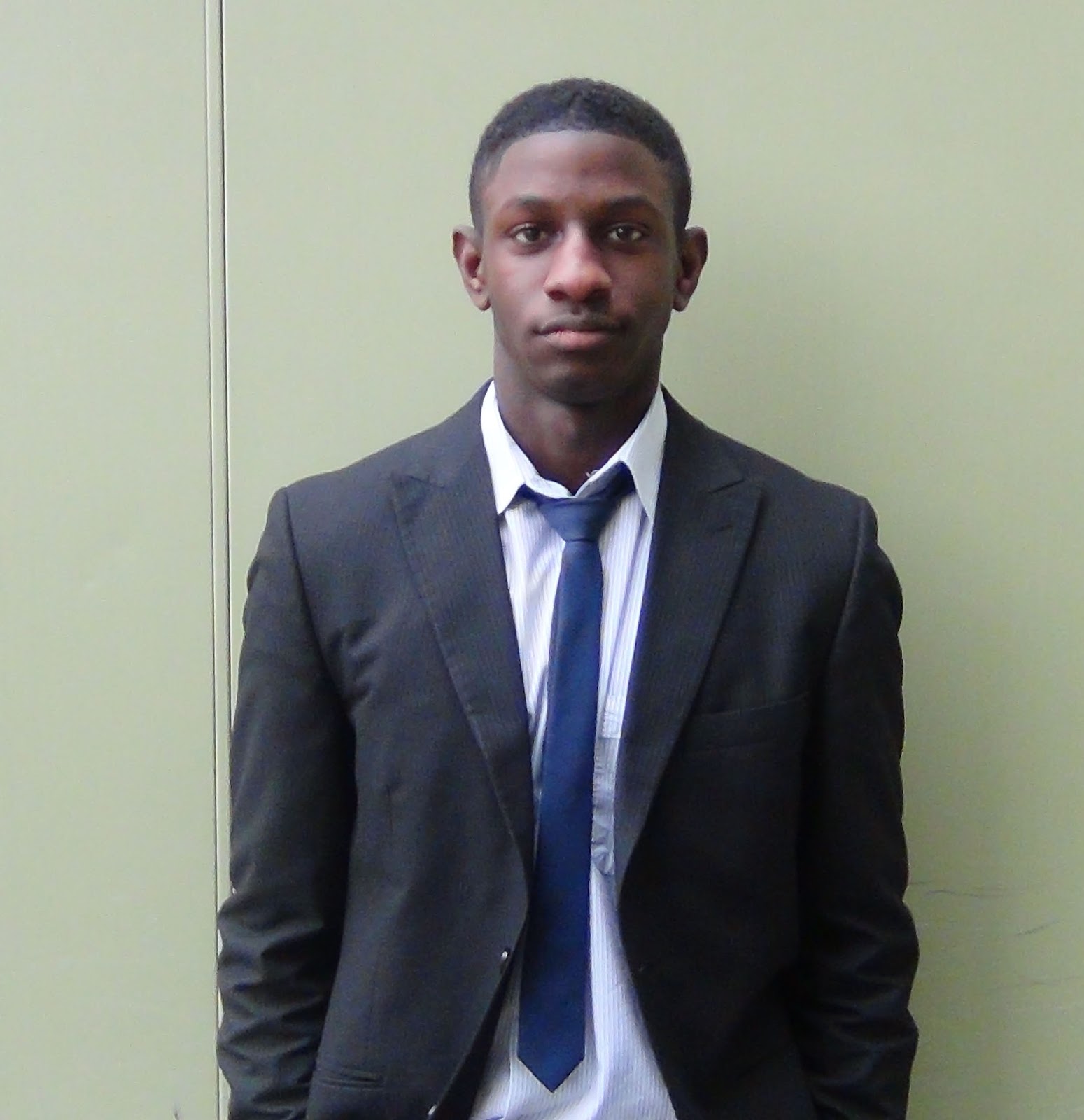
Casting.
Casting: Anonymous Man
Here are the actors that auditioned for our main character. In the end we decided Connor Froy (top) was best for the part.

Name: Connor Froy
Height: 6'1
Eye Colour: Brown
Hair Colour: Brown
Build: Medium / Slim
Agent: RAPA
Experience: 'Speed Dial' 2013
RAPA Experience
David Bowie Productions
VNA Festival
Move It Exhibition
Extra in 'Skyfall' (2012)
Audition Pitch:
'I'm the perfect height for the character, as well as having the confidence to pull off the role. The character has an air of arrogance, which i believe i will be able to pull off in my portrayal of the Anonymous man'
 Name: Charlie 'Shittu' Walters
Height: 5'9
Eye Colour: Green
Hair Colour: Strawberry Blonde
Build: Sleight
Agent Details: Self Representing
Experience: 'Speed Dial' (2013)
Cameo role in 'The Firm'
Audition Pitch:
'Im a decent actor, im a big enough build to play the dench guy. Me' old man is a cockney geezer therefore i will be suitable to play a London based character, my mum dresses me so i will be perfect for the role'
We decided that Charlie was not suitable for the role due to his lack of experience and
professionalism. His attitude towards the role was unacceptable.
 Name: Thomas Wallen
Height: 6 ft.
Eye Colour: Brown
Hair Colour: Black
Build: Athletic
Agent Details: Self Representing
Audition Pitch:
'I believe i am perfect for the role. My height is perfect for the character, as well as my build. I am smart and can pull of the formal style of acting needed for the role'
Thomas was a serious contender for the role of the Anonymous Man. However, he was unavailable for our filming dates.
 Name: Lewis Broughton
Height: 5'8
Eye Colour: Blue
Hair Colour: Ginger
Build: Slight
Agent Details: RAPA
Audition Pitch:
'I have lots of experience in acting. I have also worked with professionals and am heavily connected in the acting world. Despite my lack of height, i believe i bring a sense of formality to the role.'
Despite Lewis' vast experience, we decided against casting him as the role of the Anonymous Man, as he does not fit the description of the character.
Casting: Anonymous Man
Here are the actors that auditioned for our main character. In the end we decided Connor Froy (top) was best for the part.

Name: Connor Froy
Height: 6'1
Eye Colour: Brown
Hair Colour: Brown
Build: Medium / Slim
Agent: RAPA
Experience: 'Speed Dial' 2013
RAPA Experience
David Bowie Productions
VNA Festival
Move It Exhibition
Extra in 'Skyfall' (2012)
Audition Pitch:
'I'm the perfect height for the character, as well as having the confidence to pull off the role. The character has an air of arrogance, which i believe i will be able to pull off in my portrayal of the Anonymous man'
 Name: Charlie 'Shittu' Walters
Height: 5'9
Eye Colour: Green
Hair Colour: Strawberry Blonde
Build: Sleight
Agent Details: Self Representing
Experience: 'Speed Dial' (2013)
Cameo role in 'The Firm'
Audition Pitch:
'Im a decent actor, im a big enough build to play the dench guy. Me' old man is a cockney geezer therefore i will be suitable to play a London based character, my mum dresses me so i will be perfect for the role'
We decided that Charlie was not suitable for the role due to his lack of experience and
professionalism. His attitude towards the role was unacceptable.
Height: 6 ft.
Eye Colour: Brown
Hair Colour: Black
Build: Athletic
Agent Details: Self Representing
Audition Pitch:
'I believe i am perfect for the role. My height is perfect for the character, as well as my build. I am smart and can pull of the formal style of acting needed for the role'
Thomas was a serious contender for the role of the Anonymous Man. However, he was unavailable for our filming dates.

Height: 5'8
Eye Colour: Blue
Hair Colour: Ginger
Build: Slight
Agent Details: RAPA
Audition Pitch:
'I have lots of experience in acting. I have also worked with professionals and am heavily connected in the acting world. Despite my lack of height, i believe i bring a sense of formality to the role.'
Despite Lewis' vast experience, we decided against casting him as the role of the Anonymous Man, as he does not fit the description of the character.
Thursday 25 April 2013
2. How does your media product represent particular social groups?
How does your media product represent particular
social groups?
For this part of the evaluation I have made a mock a newsletter to the 'investors' detailing how our production company is aiming to be different through the social groups we portray, I have used Microsoft Word and/or Publisher to do create the document, which will also includes some other points about the film to add film to add realism. I have named it 'the Lighthouse' after our logo.
The main answers feature in the piece regarding how our product represents are the following:

The main answers feature in the piece regarding how our product represents are the following:
- It shows an extravagantly wealthy man
- It shows the same man as a homeless man
- The film therefor denotes both a plutocratical class and also the lowermost people in society.
- Even if a viewer had come into contact with one of these classes it is extremely unlikely that they would of ever came into contact with the other.
- Therefor our product represents are, within media and often society as a whole, the unrepresented.

Wednesday 24 April 2013
Tuesday 23 April 2013
Evaluation Planning.
Evaluation: Planning.
The questions we will need to answer.
1. In what ways does your media product use, develop or challenge forms and conventions of real media products?
2. How does your media product represent particular social groups?
3. What kind of media institution might distribute your media product and why?
4. Who is the main target audience for your product?
5. How did you attract/ address your target audience?
6. Looking back at your preliminary task (the continuity editing task), what do you feel you have learnt in the progression from it to full product?
7. What have you learnt about technologies from the process of constructing this product?
How we will answer these questions.
We aim to present our evaluative answers to these questions using a range of creative mediums, our initial ideas of doing this include:- Making a directors commentary.
- Interviewing members of the public and assessing what they think of certain aspects (i.e. 1. In what ways does your media product use, develop or challenge forms and conventions of real media products?)
- Utilising software such as Go!Animate which we have gained experience with through our coursework.
- Making newsletters to our investors detailing answers.
Monday 15 April 2013
Tuesday 9 April 2013
Filming day 2
Filming Day 2.
Our second attempt at filming got off to a bad start when our main character was ill and therefor had to drop out at the last minuet. At short notice it was hard to find someone else to step in for him so I stepped in to play the role of the nameless man. This was both helpful and unhelpful: helpful because I could play the role exactly as I wanted it; unhelpful as I could not frame shots as much as I would of liked to, being in front of (rather than behind) the camera.
Filming Day 1.
Filming Day 1.
On the first day of filming we awoke to a severe amount of snow that had fallen overnight. This made filming almost impossible as we would be reliant on public transport to get both to and between filming locations. We postponed filming by two weeks to wait out the unpredictable weather.
Thursday 21 March 2013
Final Logo.
Final Logo
Although it was a tough choice, however we decided the logo that fitted in best was the lighthouse (logo #3.) Here it is again:


Wednesday 20 March 2013
Logo idea #3
Logo idea #3

A big S: This was memorable and simplistic, giving a raw yet noticeable feel to our logo. Something that is held important by many independent film companies, including ours.
Logo idea #2
Logo idea #2

A lighthouse: We thought this would, again, be an interesting metaphor as despite being isolated from the rest of society a lighthouse does so out of its duty to help portray the dangers that others may face.
Logo idea #1
Logo idea #1.

An axe cutting wood: When wood is cut the dark outer bark is broken to reveal the tree-rings. These tell us more about the tree the the outside ever could. This is essentially a metaphor for independent companies shedding new light on society.
Naming our company (prezi form)
NAMING OUR PRODUCTION COMPANY.
Here is a Prezi showing our journey of ideas leading to our title.
Thursday 14 March 2013
Wednesday 13 March 2013

Location: Main Characters House
We will use this house in Crystal Palace (south-east London) as the main characters home. Although we have permission from the owner to film, we will not need to disturb them as the opening shot can go up 'from the gutter' (this is symbolic of the characters rise and decent) and by the time the camera has reached the top of the stairs the door would be shut (we can add in a sound effect of a door shutting to show this).


Monday 11 March 2013
Naming Our Production Company .
Amongst the ideas we discussed was the concept that, being lower budget there is less risk of creatively experimenting in an independent film. Therefor they may seek to portray scenes that the mainstream media does not. To fit in with this we thought of using the titles 'Subterfuge', 'Fly on the wall' or 'Letterbox'. All of these suggest the the audience that they will be exposed to something they might usually not be.
From this, we moved onto the idea that an independent production company with no ties to any conglomeratory giants. This would therefor mean the company could stand alone and that the creative flair would not be held back by its corporate ties. We decided a word that defined this for us would be 'Solitude'.
Solitude: (noun) The state or situation of being alone.
Synonyms: privacy - seclusion - isolation
We then undertook the task of turning our chosen name into a recognisable logo. these will be shown in future posts.
Friday 8 March 2013

Thursday 7 March 2013
Location and Casting.
Location
Opening Shots
The film opens with shots of an affluential part of London. This would set the scene and show the kind of life our character has become accustomed to. We could use areas such as Chelsea, Mayfair or Fulham were wealth is stereotypically found. The shots will show a man leaving an expensive and old georgian style house. This will be easy to film as we do not need to go inside the house, only use the stairs leading up to the house. However, to be sure, we will ask permission to film from the owner of the house/building we use. Our original idea involved filming inside an up market showroom apartment. We asked the company 'Berkley Group' to use one of their apartment to film in. Unfortunately, they declined.
Shots at Work
We were unable to secure office space outside of our school environment. Therefore we will have to film on school grounds. This will not be a problem, as their are many locations where we can film these scenes and it will be easy to get permission.
Shots outside of Car Garage
To emphasize the main characters wealth, we show him outside a car garage, planning on purchasing a new car. The car garage we will use, 'De Stefano' is in Hayes, Kent. We will not need to film inside the garage, therefore we will not need to ask for permission to film.
Closing Shots
The closing scenes will be shot in a more urban, raw part of London such as Southbank, Camden or Lewisham. We will also need to film at a train station, as that is when we show the title of the film, as well as introducing the new situation for the previously wealthy, successful business man. After visiting many London train stations, I believe Grove Park Station, is the best location for the shots we need.
Casting
Nameless Business Man... Connor Froy.
(We originally casted one of ourselves as the main charceter, however, we lack the height needed for the characters description, but could be used for extras.)
Wednesday 6 March 2013
Wednesday 27 February 2013
What is an opening Sequence?
A typical opening sequence follows the rigid framework of introducing characters and establishing the location. Titles are also used to show who is acting in the film, and the people involved in the production process. For example: Director, Producer, Executive Producer and Screenplay writer. The order of the titles is often determined by the nature of the film and the status of its class. For example productions directed by Quentin Tarentino will almost always feature his name first, whereas other films will feature the name of an actor. An example of this is the opening sequence of the film 'Drive', where Ryan Goslings name appears first. In an independant film there are, very generally speaking, less well established actors or actors that are looking to make the transition to film from television or theatre. This normally results in the production company being shown first.
after analysing the opening sequence of Marvel's 'Avengers Assemble' and others I noticed that the follow sequence pretty generally applied:
1) Black title shot with Director title.
2) CGI shots begin, introducing films main characters.
3) Titles to introduce the crew continue: Story By:, Screenplay By: and Executive Producer.
4) Single titles used with shots of the characters costume are used. For example: Robert Downey JR. next to a shot of Iron Man' mask and Chris Hemsworth next to Thor's Hammer
5) The final shot uses a title for the studio. 'Marvel Studios'
6) Match-on-Action shot used. Cuts from tesseract to close up shot of moon. Marks the start of the film.
Saturday 23 February 2013
Feedback - TJ - Feb 23rd
Charlie,
WWW
Very nicely presented (Influences post) and neat blog. Your posts that you have here are actually very good, and have decent evaluative commentary with it.
EBI
As good as these posts are now, you are lacking a large number of posts. You should really have at least 10 posts by now. Please step it up.
Also you must upload your preliminary task!
Blog Grade: D
Tuesday 12 February 2013
Influences.
credits: Although Se7en is not a film that would fit into the genre of social reality, I feel that the gritty and scribbled text affects would fit nicely into it, it also used a combination of titles on plain black backgrounds and also texts on image. The shots are also simple and similar shots could be replicated easily.
shocking images: The sequence here shocks viewers. It uses melancholy audio to link it with unsteady shots, these replicate some who is scared shaking, showing the horror an that the characters have undergone.

influences in reality:
I have collected some images from the media showing the economic state of London, a large and apparently wealthy city. both through newspaper headlines from the Guardian and the Independent. The is also an image of shops abandoned on a south London high street. There is also a small collage showing general headlines about people losing everything in the recession. I tried to focus especially on London as it would be a good place for filming to film, as everyone in my group has had some first hand experience of the images we would be trying to portray.

Friday 8 February 2013
Mood Board.
To create my moodboard I used images from iconic social realism films, This is England, Trainspotting, Harry Brown and City of God. I have also included gritty images of a twisted/scary character (the Joker), rough housing estates, a homeless man, a wad of cash and also a london underground station. These would all fit in well to a social reality film and they often portray societies misfits or elements of society that most film makers would rather sweep under the rug.

Monday 4 February 2013
Opening Sequences Analysis.
Crime/Drama: 'Drive' (2011) Nicolas Winding Refn
The opening sequence of this film opens with shots of a bustling city at night. This shot establishes the setting and also gives it an epic feel as the audience can see the city is massive. We see a close up of the main character driving, it is a long take, this familiarises the viewers with him before any other characters are introduced and also gives you an understanding of him as a character. An example of a characteristic we find out is that he is a cool/calm individual from his leather driving gloves and his tooth pick. There is then a birds eye view shot of the car driving through the streets, once again this emphasises the grandiosity of the setting. We then see the car he drives for the first time as it pulls into a parking lot, the camera follows it suggesting it demands attention and is therefor a status symbol. The camera then cuts the an over the shoulder shot of the man walking, we can clearly see a gold scorpion on his jacket, this gives the impression that he is both an individual and also chooses to embrace an abnormal life. The scorpion could also be a clue to something that happens later in the film. there is a POV shot from the characters perspective, showing him looking at a woman, this could mean hat he is either a womaniser or perhaps that despite what looks like a luxury lifestyle he is alone and has no one to share it with. The lift then closes, the doors are golden, this could show that he allows what some may class as important, to be blocked out of his life by materialistic things and wealth. Ryan Goslings character enters the hotel room shortly after, in the sequence of showing him alone and in the darkness, this could be an microcosm of his life. We also see his shadow looming on the wall, this could show that he leads a double life, and finds it hard to escape. During the last shot the man turns out a light, as he does this the music stops. This sound keeps the music in sync with the filming. We then see even more shots of the city suggesting its importance once again. The final shot is an over the shoulder shot of him looking through the windscreen, this could suggesting that new things are coming to him.
The first title we see is 'Ryan Gosling', the name of the the main actor. This shows his character high status in the film. It could also ease people into the film as they may know him already. The titles, in an informal San-Serif font, and are shown over footage, this is stereotypical of a modern hollywood film, as appose the the older ones that often cut to blank screen showing just the names.
The soundtrack is synthesised electro. This sort of music is typical of the 80's and could suggest either that the film is set in this era or perhaps that the film shares some of the social perceptions people had of 80's USA, such as excesses of wealth and fast paced lifestyles.
Comedy: 'Step Brothers' (2008) Adam Mckay
The first thing the audience see is an 'actual quote' from George Bush, who was the president of the USA when the film was released, this aids the audiences interpretation of what a typical American family should be/is. The opening titles then start rolling in a traditional blank screen format, however we see the firs comical/immature aspect in the way that they are in a chalk-style font, this immediately makes the initial quote seem sarcastic and therefor gives an impression that the stereotypical interpretation is soon to be broken. A crackling audio can be heard over the titles, this could be mistaken as the vintage crackling of a record, however when the first shot comical reveals that it was actually just the noise of crisps being put onto a plate, we see once again that stereotypes and interpretations are going to be broken. The occurrence of breaking initial interpretations continues when we see a close up of hands hands preparing nachos and cheese, the audience are led to believe that the character is an adolescent, but but a shot of him looking into the microwave shows that he is infact an adult. Some titles showing important but less focal characters, such as the mother of Will Ferrels character, are shown over shot, this allows the audience to continue watching the opening sequence whilst giving them the option to watch it. When the second son is speaking to his dad, the dad is standing in the doorway suggesting to the audience that his son is firmly distanced from him and he would not want to step into the world of childishness, also the son is dressed in clothes that are clearly too small, suggesting he has grown out of his lifestyle. The sequence then cuts to an establishing shot of a chandelier, the class and elegance of such an time again showing instant contrast to the lifestyles of their children. When the man is giving a speech there is shot reverse shot, showing that there is a mutual attraction between the two of them, they are both wearing lighter clothes making them stand out a lot more to the audience. The soundtrack is also merry and upbeat suggesting, at the start of the movie at least, all is well and happy.
Social Realism: 'Trainspotting' (1996) Danny Boyle
The sequence opens with a block title, stating the production company, this shows how Channel 4 (a relatively small company in the world of film making) are eager for recognition of this cinematic piece of art. We hear the sound of footsteps running, before we see or hear anything else, this could suggest that it is fast paced, they use a sound a sound motif to link the footsteps into a sound motif. The first man (Renton) running. This immerses the audience into the film from the very beginning. Each character is then introduced with a short shot, and then a freeze frame with their name in shot. The shots help show the characters behaviour and characteristics. For example: 'Spud' concedes a goal, and the rest of his team shout at him. This could show that he is the weakest of the group. Another example is 'Begbie'. He tackles violently. This could suggest he is a violent character. The clip ends with a shot of Renton laid out on the floor. This is to show the harm that his addiction does to him. In regards to titles, only one is used. 'Channel Four Films represents'. The title is used on a single black slate, and is only on screen shortly. The reason only one title is used is to keep the audience immersed in the experience. Audiences are meant to be sucked in to the lifestyle of the film. In this case, fast paced. If more titles were used, the pace would be a lot slower.
Subscribe to:
Posts (Atom)